Logos are the visual identity of a brand, and behind every great logo lies a story, a purpose, or even a hidden meaning. From simplicity to intricate design, brand logos have evolved into powerful symbols that we instantly recognize. But did you know that many logos hold secrets or interesting facts that are not immediately obvious? Let’s dive into some intriguing facts about famous brand logos that you might not know!

Amazon’s Logo Is All About Smiles and Variety
Did you know that Amazon’s logo isn’t just a name with an arrow? The arrow stretches from the letter “A” to “Z,” signifying that Amazon offers everything from A to Z. But it’s not just a directional symbol—the arrow also doubles as a smile, reflecting customer satisfaction and the brand’s aim to make shopping a joyful experience.
FedEx’s Hidden Arrow
FedEx is famous for its simple and clean logo, but did you know it has a hidden symbol? Look closely between the letters “E” and “x,” and you’ll notice a subtle arrow pointing forward. This cleverly designed arrow represents the brand’s forward-thinking approach and commitment to speed and efficiency.
Apple’s Bite Has Meaning
The Apple logo is one of the most recognizable in the world, but have you ever wondered why there’s a bite taken out of the apple? The bite was added to distinguish the fruit from a cherry, and it also cleverly plays on the word “byte,” a unit of digital information. A perfect nod to Apple’s tech roots!
Toblerone’s Bear
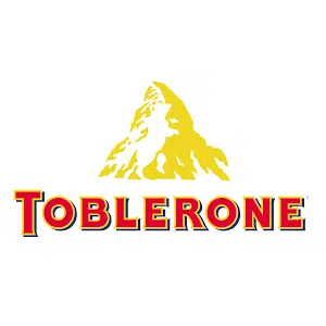
The Toblerone logo might look like a simple mountain, but did you know there’s a hidden bear inside? The Swiss chocolate brand is based in Bern, Switzerland, a city whose symbol is a bear. The animal is cleverly integrated into the mountain, paying homage to the brand’s origins.
Baskin-Robbins’ 31 Flavors
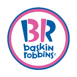
Baskin-Robbins is known for its variety of ice cream flavors, but did you know that their logo subtly highlights this? If you look closely, the “BR” in the logo doubles as the number 31, representing their original 31 flavors—one for every day of the month.
Toyota’s Symbolism Runs Deep
Toyota’s logo seems like a simple oval design, but there’s more to it than meets the eye. Did you know that the three overlapping ovals represent the union of the customer, the product, and the brand? Plus, the ovals also form every letter of the brand name “Toyota” when you break down the shapes.

Pinterest’s Pin
Pinterest’s logo might look like simple typography, but did you know the “P” in the logo is actually designed to resemble a pin? The platform’s whole concept revolves around “pinning” items of interest, and this clever design aligns perfectly with the brand’s core functionality.

Google’s Playful Colors
Google’s logo is colorful, but did you know there’s a reason behind the choice of colors? The brand uses primary colors (red, yellow, and blue) except for the green “L,” which was intentionally added to show that Google doesn’t follow conventional rules. This playful approach mirrors the brand’s innovative and non-traditional ethos.
LG’s Hidden Face
LG’s logo contains a hidden face that many people overlook. The “L” and “G” form a winking face, which conveys friendliness and approachability. It’s a subtle but effective way of showing that the brand is people-centric, focusing on creating connections with its customers.
Audi’s Rings
Audi’s four rings represent more than just a sleek design. Did you know that they symbolize the four founding companies—Audi, DKW, Horch, and Wanderer—that merged to form the brand we know today? Each ring represents one of these companies, making it a significant part of Audi’s history.
Pepsi’s Multi-Million Dollar Logo
Did you know that Pepsi’s logo design cost a whopping $1 million? The logo, designed in 2008, involved in-depth research, including an analysis of the golden ratio, feng shui, and even planetary alignment! The circular shape represents more than just a soda—it’s said to signify the earth’s magnetic field, energy dynamics, and other complex theories. It’s a brand logo with deep symbolism and a hefty price tag to match!
Adidas and the Three Stripes
Adidas’ iconic three stripes are instantly recognizable, but did you know that the brand didn’t originally come up with this idea? The three-stripe design was actually purchased from a Finnish brand, Karhu, for just $1,600 and two bottles of whiskey in the 1950s. Since then, Adidas has made the stripes synonymous with their brand, turning it into one of the most famous logos in sportswear.
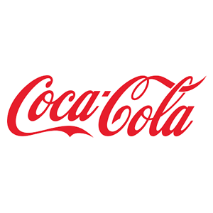
Coca-Cola’s Hidden Danish Flag
Coca-Cola’s logo is known worldwide, but it has a surprising connection to Denmark. Did you know that if you look at the logo closely, a portion of the script forms a part of the Danish flag? Coca-Cola leveraged this discovery during a marketing campaign at Denmark’s largest airport, which is one of the happiest countries in the world, fitting well with Coke’s brand philosophy of joy and happiness.
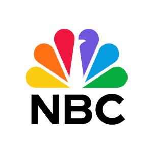
NBC’s Colorful Peacock
NBC’s colorful peacock logo is instantly recognizable, but do you know the reason behind it? When NBC switched to color broadcasting in the 1950s, they wanted to show off their technological innovation. The peacock with its multicolored feathers was designed to symbolize the vibrant range of colors the network could now broadcast. Each feather also represents one of NBC’s original divisions, including news, entertainment, and sports.

Chanel’s Iconic Interlocking Cs
Coco Chanel’s interlocking “C” logo is one of the most luxurious and famous fashion logos in the world, but did you know its origins are debated? Some say the logo was inspired by the design of stained glass windows at a chapel in France where Coco Chanel spent her early life. Others believe it represents her initials. Regardless of its roots, the simple elegance of the logo continues to symbolize timeless sophistication.
BMW’s Airplane Propeller Myth
Did you know that the popular belief about BMW’s logo representing an airplane propeller is actually a myth? While the blue and white pattern does resemble a spinning propeller, the real inspiration comes from the Bavarian flag (the region in Germany where BMW originated). The company was initially involved in aviation, so the propeller association stuck, but the design is truly a nod to its Bavarian roots.
Nike’s “Swoosh” and Its Low Price
The Nike “Swoosh” is one of the most recognizable logos globally, but did you know that the designer, Carolyn Davidson, was paid just $35 for her work? The swoosh is meant to convey movement and speed, and its simplicity aligns with Nike’s focus on performance and athleticism. Years later, Nike compensated Davidson with stock options, which turned into a much more significant reward!
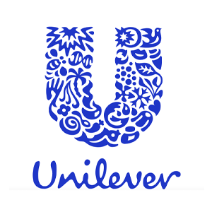
Unilever’s Symbol of Sustainability
Unilever’s logo is packed with symbolism—each small icon within the large “U” represents something important to the brand. For example, the palm tree represents the agricultural roots of their products, the fish symbolizes seafood sustainability, and the heart represents health and well-being. Unilever’s logo isn’t just a design; it’s a visual manifesto of their commitment to sustainability and social responsibility.

Mercedes-Benz’s Three-Pointed Star
Mercedes-Benz is synonymous with luxury, but did you know that the iconic three-pointed star in its logo has a deeper meaning? The star represents Mercedes-Benz’s ambition to dominate transportation across land, sea, and air. It’s a simple yet powerful symbol of the brand’s broad vision and influence in various industries beyond just automobiles.
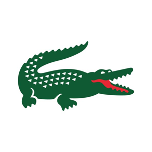
Lacoste’s Crocodile
The Lacoste logo, with its famous crocodile, was one of the first brand logos ever to be displayed prominently on clothing. But did you know the origin of this logo? It’s a nod to the brand’s founder, René Lacoste, a famous tennis player whose nickname was “The Crocodile” due to his fierce on-court tenacity. The logo became an iconic status symbol for luxury sportswear.
Logos are much more than just shapes, letters, and colors. They carry stories, hidden meanings, and historical significance that often go unnoticed at first glance. From hidden symbols to clever designs, these branding marvels are a testament to the creativity and strategy behind successful companies. The next time you see one of these logos, you’ll be able to appreciate the deep thought and unique history behind them.