Revitalizing
Adventure
A Journey through rebranding of Adventure Packers
In the world of adventure tourism, where every expedition tells a story, a brand's identity is the compass that guides it through the wilderness of competition. Today, we're thrilled to share the captivating story of Adventure Packers, an adventure tourism company that has recently undergone an exhilarating rebranding journey.
Join us as we explore the facets of their transformation, from brand strategy to a vibrant new visual identity.

Brand Strategy: Charting the Course for Success
The cornerstone of Adventure Packers’ rebranding process was a meticulously crafted brand strategy. This strategic blueprint set the course for their exciting journey of transformation. Here’s what it entailed:
- Rediscovering Their Essence:
Adventure Packers redefined their core identity, focusing on their passion for adventure and commitment to nature. They envisioned themselves as more than just a travel company; they saw themselves as stewards of unforgettable experiences. - Audience Exploration:
To ensure their rebrand would resonate with a broad spectrum of adventurers, Adventure Packers delved deep into understanding their target audience. They sought to be inclusive, welcoming everyone from the thrill-seeker to the nature enthusiast.
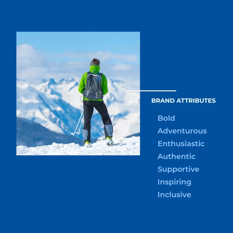
Brand Attributes: The Pillars of Character
To anchor their brand firmly, Adventure Packers identified key brand attributes that would define their personality and resonate with their audience:
- Adventure-Driven: Their adventures are fuelled by the love for adrenaline-pumping experiences, symbolizing the very essence of adventure.
- Nature-Centric: Adventure Packers’ rebranding highlighted their commitment to responsible tourism and their deep-rooted connection with the natural world.
- Expertise: They portrayed themselves as more than just guides; they became the embodiment of adventure expertise, making travellers feel safe and confident.
- Inclusivity: With open arms, they invited adventurers from all backgrounds, breaking down barriers to exploration and adventure.
Visual Identity: Capturing the Spirit of Adventure
The rebranding process unveiled an entirely new visual identity for Adventure Packers, encapsulating the spirit of adventure in every detail:
- Dynamic Logo:
The logo now featured an abstract icon inspired from a mountain sheep and also resembling letters A & P. We focused on simplicity and curated a clutter-free logo to make it more memorable and versatile and also to connect to a wider spectrum of audience. - Logo Font:
The font “Luckiest Guy” clearly outlined the brand’s personality and invoked emotions like fun & playfulness, giving it an informal and retro vibe while maintaining youthfulness in the overall design.
Color Palette: Painting Adventures with Hues
The primary & secondary color palette played a vital role in Adventure Packers’ rebrand, using colors to evoke emotions and reinforce their brand identity:
- Medium-Dark Cyan Blue: A dark blue, symbolizing trust, professionalism, stability, and reliability; exudes a sense of calm and confidence.
- Dark Sea Green: Sea green, also known as aqua or turquoise, is associated with qualities like tranquility, creativity, balance, and nature.
- Vivid Orange: Vivid orange, known for its energy, enthusiasm, warmth, and playfulness; creates a sense of excitement and enthusiasm.
- Bondi Blue: Bondi Blue signifies Adventure Packers’ approaches towards innovation in adventure, unique and extraordinary experiences and incorporating technology to enhance the adventure experience.
Brand Voice: A Resonant Echo in Every Message
Adventure Packers’ brand voice underwent a transformation, aligning with their brand attributes:
- Adventurous and Energetic: Their brand voice became charged with energy, mirroring the exhilaration of their adventures and calling their audience to action.
- Inspiring and Informative: Adventure Packers sought to inspire while educating. Their brand voice blended motivation with practical knowledge, nurturing the adventurer’s spirit.
- Friendly and Approachable: To ensure inclusivity, their tone was friendly and approachable. Every interaction felt like chatting with a friend who shared the same passion.
In conclusion, Adventure Packers’ rebranding journey is a testament to the power of strategic brand transformation. By crafting a solid brand strategy, defining brand attributes, creating a dynamic visual identity, adopting a resonant brand voice, and using a carefully curated color palette, Adventure Packers has not only reinvigorated their brand but also opened the door to new adventures and new horizons. As they set out to inspire a new generation of adventurers, their compass is firmly pointing toward success.


