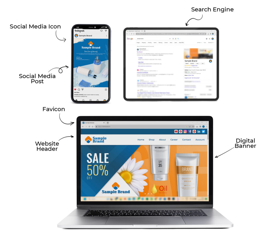
Importance of a Responsive Logo
Adapting Your Brand for the Digital Age
In today’s digital landscape, where brands are experienced across a multitude of devices and screen sizes, the importance of responsive design cannot be overstated. Your brand’s visual identity, encapsulated in your logo, must be versatile enough to adapt seamlessly to various contexts. In this blog post, we’ll explore the concept of responsive logos, why they are essential in the digital age, and how they can help your brand maintain consistency and recognition across all platforms.

What Are Responsive Logos?
Responsive logos are logo variations specifically designed to adapt to different screen sizes, resolutions, and devices while preserving their core visual elements and brand identity. Unlike traditional static logos, responsive logos offer flexibility, ensuring that your brand is recognizable and aesthetically pleasing across a wide range of digital and print applications.
Why Responsive Logos Matter?
Multi-Device World: In the digital age, your audience interacts with your brand on smartphones, tablets, laptops, desktops, smart TVs, and more. Each of these devices has its unique screen dimensions and resolutions. A responsive logo ensures your brand looks its best on all of them.
User Experience: A responsive logo contributes to a better user experience. When users access your website or app, they expect visuals to adapt smoothly to their screens. A logo that appears distorted or tiny on a small screen can detract from the overall user experience.
Consistency: Maintaining a consistent brand image is essential. Responsive logos help ensure that your brand’s visual identity remains intact, whether it’s on a social media profile, website header, or printed material.
Recognition: A brand’s logo is often its most recognizable element. A responsive logo guarantees that even when scaled down, it retains enough visual integrity for users to recognize and remember.
Future-Proofing: As new devices and screen sizes emerge, a responsive logo can save you from continually redesigning your logo for each new platform.
Designing a Responsive Logo for Your Brand
Creating a responsive logo for your brand involves thoughtful design and consideration of how your logo elements will adapt across various platforms. Here’s a step-by-step guide:
Identify Core Elements
Determine the essential elements of your logo that must remain consistent across all variations.
Simplify
Streamline your logo for smaller screens by removing non-essential details and text.
Scaling
Test how your logo scales down and ensure that it remains legible and recognizable.
Aspect Ratios
Create logo variations for different aspect ratios, such as square and rectangular, to accommodate various platform requirements.
Color Variations
Consider how your logo will appear in grayscale or with reduced color options for situations where full color is not feasible.

User Testing
Conduct user testing to gauge recognition and usability of your responsive logo on different devices.
Implementation
Ensure that your responsive logo is implemented consistently across all digital platforms.
As we navigate the digital age, responsive logos have become a necessity for maintaining brand consistency and recognition. Your logo is the visual representation of your brand, and it should adapt gracefully to the diverse digital landscape. By designing and implementing responsive logos effectively, you can ensure that your brand makes a memorable impression across all devices and platforms, securing a strong and lasting presence in the digital age.
